In 20+ years of selling homes, I watched professional stagers transform spaces with one strategic tool: color. Not paint. Not furniture. Color itself.
Here’s what surprised me most. Research from the National Association of Realtors shows that up to 90% of homebuying decisions are influenced by color. But colors in home aren’t just about making buyers fall in love. They shape how a space feels to live in, every single day.
Color affects mood, energy, perception, and even how large or calm a room feels. It influences whether a home feels inviting or cold, grounded or chaotic. And once you understand how it works, you stop guessing and start choosing with intention.
This post breaks down what different colors do to your brain, your mood, and your home’s perceived value, covering green, blue, red, and black, plus how lighting can completely change the way colors in home show up after sunset.
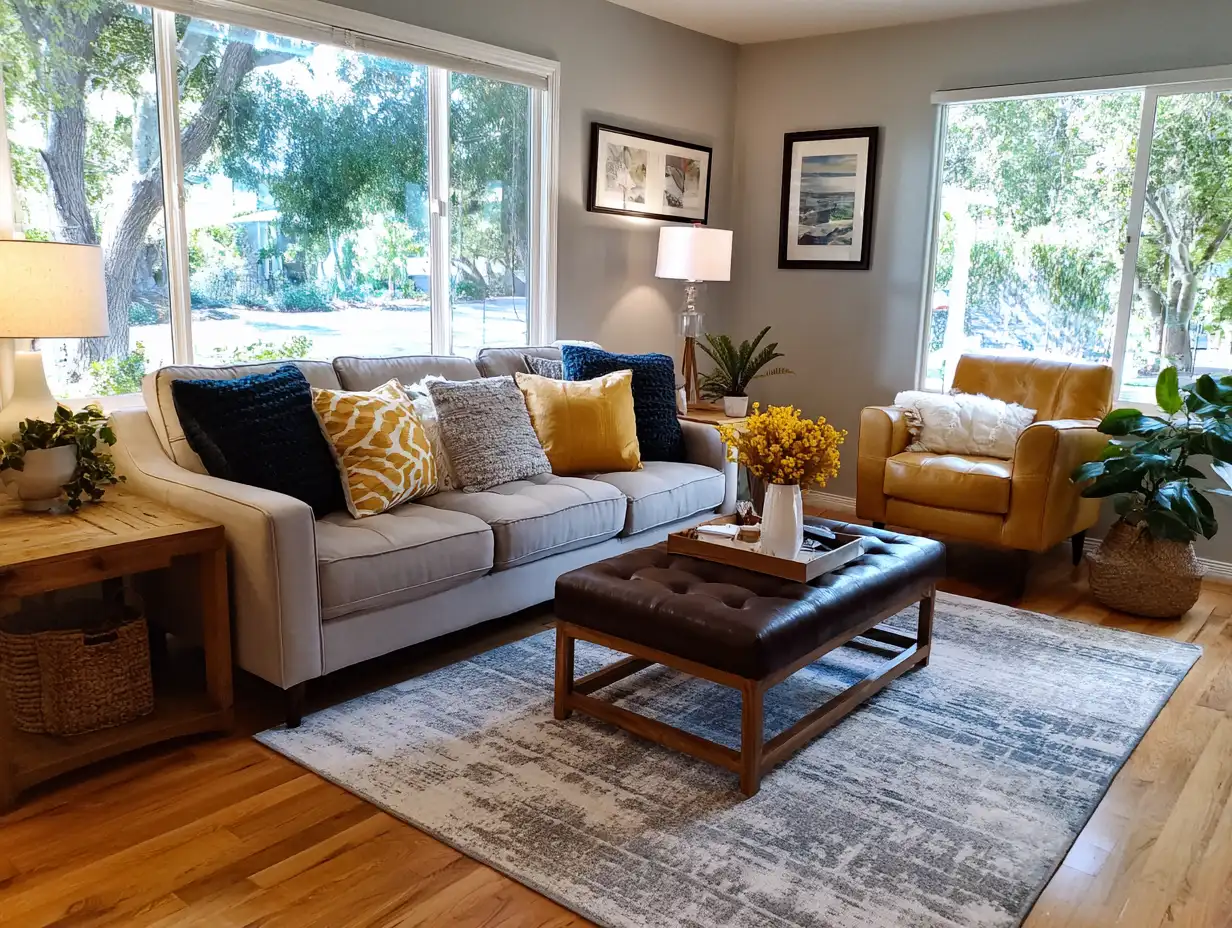
Table of Contents
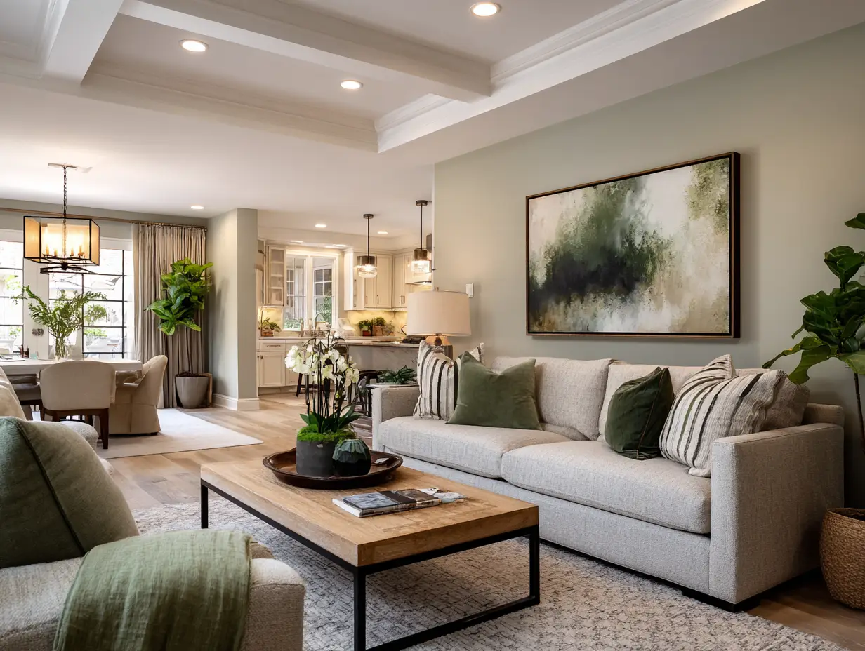
Green: The Best Color for Calming Spaces
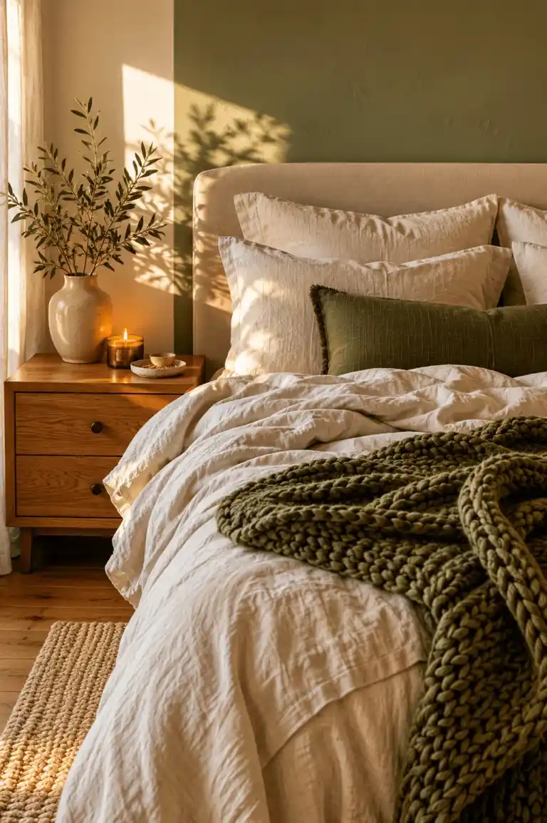
Green has a measurable calming effect: it lowers heart rate and reduces stress. That’s why it’s central to biophilic design and one of the best colors for living room spaces where you actually want to relax.
But green paint is risky. Buyer feedback and stager guidance tied to NAR insights show that green walls can look dull or even sickly in certain lighting, especially in bedrooms or small spaces where calm matters most, like the strategies I share in 7 Tiny Bedroom Ideas That Instantly Transform Small Spaces.
Instead, green works best when it’s removable.
Where green works
- Bedrooms and living rooms that need calm
- Small or sterile spaces that feel cold
How to add it
- Plants or faux greenery
- Sage or olive pillows
- Botanical art
Used this way, green keeps colors in home low-commitment but high-impact. Buyers respond to it because it feels fresh and healthy, and homeowners love it because it makes a space easier to live in.
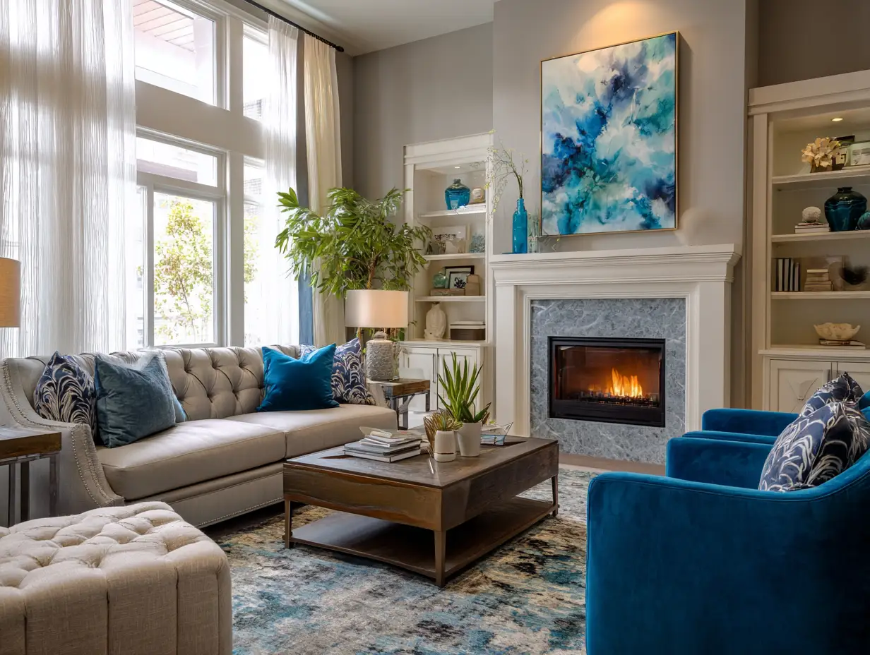
Blue: Trust, Stability, and Why It Works in Every Room
Blue is processed by the brain as calm, stable, and trustworthy. That’s why it’s used so heavily in finance, healthcare, and corporate branding- it lowers anxiety and builds confidence without demanding attention. In colors in home, blue quietly reassures.
As a cool color, blue also makes spaces feel cleaner and more expansive. It’s one of the best colors for living room spaces because it adds depth without overwhelming the room, especially when layered with warm lighting.
Where blue works best
- Living rooms that need polish without feeling cold
- Home offices where focus matters
- Bedrooms when paired with warm bulbs
How to add blue without risk
- Navy or slate curtains for structure
- Blue-toned abstract art
- Dusty blue or steel-colored pillows
Blue is hard to overdo when used this way. It adds color without chaos, which is exactly why buyers respond to it and why it works so reliably in everyday living.
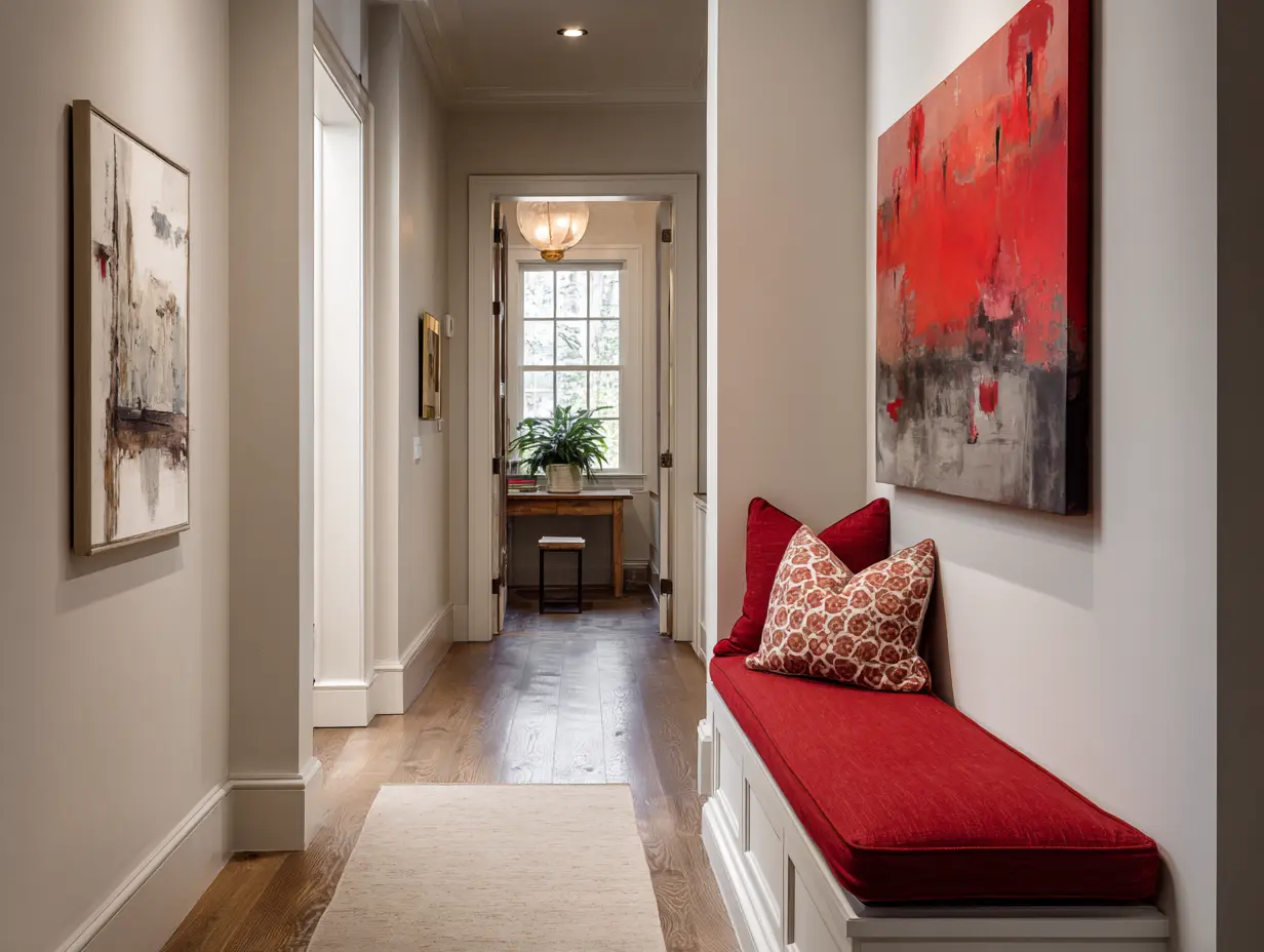
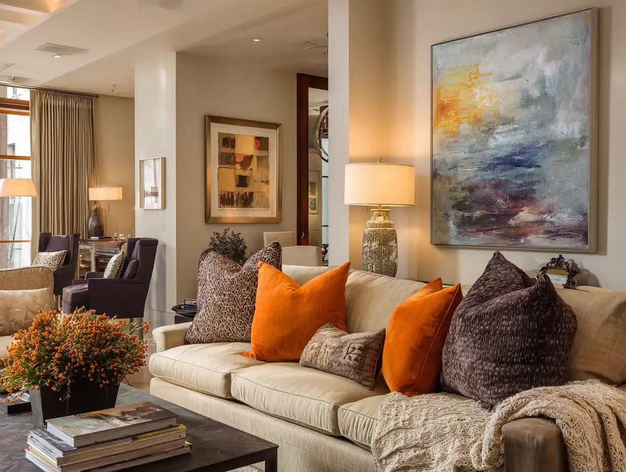
Red: Powerful Energy, Best Used as an Accent
Red is the most stimulating color your brain processes. It raises heart rate, increases alertness, and grabs attention fast. That’s why it shows up in branding everywhere, but in colors in home, that same intensity can overwhelm quickly.
Red often gets labeled as the best accent wall color, but that reputation only holds when it’s used sparingly and intentionally, not as a default design move.
Where red works
- Dining spaces in small doses
- Powder rooms where boldness feels intentional
- Accent moments, not entire rooms
How to use red safely
- One rust or deep red throw layered into neutrals
- Red pottery, vases, or sculptural decor
- A single bold art piece instead of paint
Red isn’t about calm or comfort. It’s about movement and attention. When used sparingly, it adds personality and warmth without hijacking the mood of the room, which keeps colors in home feeling balanced instead of loud.
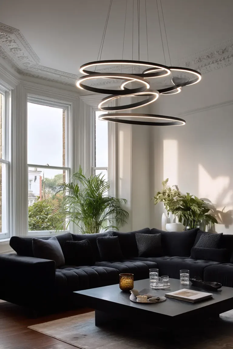
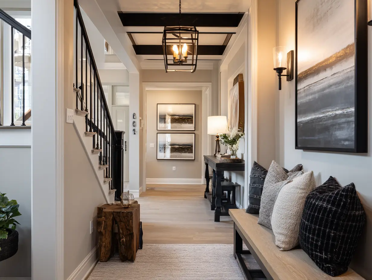
Black: Adding Luxury Without Overdoing It
Black instantly signals intention. It reads as modern, grounded, and elevated when used with restraint, which is why it works so well in colors in home as a finishing color, not a foundation.
This is where people misstep. Too much black absorbs light and makes a space feel heavy or closed in. But used strategically, it sharpens everything around it and makes other colors look richer and more deliberate.
Where black works best
- Front doors for instant curb appeal
- Light fixtures and sconces
- Cabinet hardware and door handles
- Picture frames to unify a gallery wall
How to use black well
- Matte black hardware for subtle contrast
- One black accent piece, not a set
- Black lighting paired with adjustable LEDs
Think of black as the punctuation mark in your space. It doesn’t tell the whole story, but without it, the sentence feels unfinished, and with just enough of it, the entire room reads cleaner, sharper, and more confident.
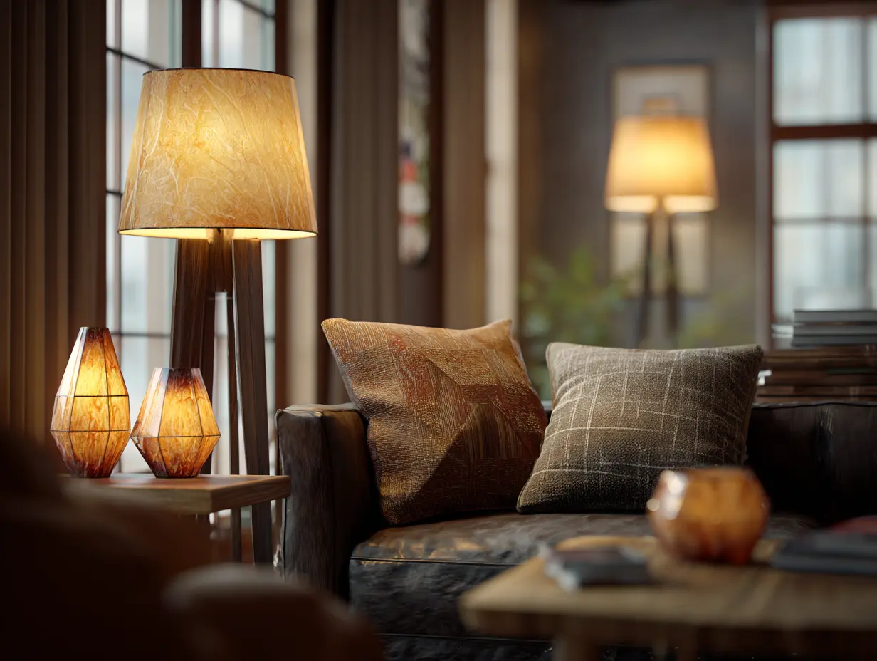
Cool Colors vs Warm Colors: How Lighting Affects Colors in Home
The same color can feel cozy, flat, or harsh depending entirely on lighting. Before you judge a color, you have to understand what light is doing to it.
Home Lighting Chart:
| Lighting Type | Effect on Colors | Best For | Avoid With |
|---|---|---|---|
| Warm/Incandescent | Adds yellow undertones, cozier feel | Reds, oranges, warm neutrals | Cool blues, grays |
| Cool/Daylight | Adds blue undertones, crisp feel | Blues, greens, whites | Warm beiges, yellows |
| LED (adjustable) | Can shift warm to cool | Any color – versatile | N/A |
| Natural Light | Changes all day, most accurate | All colors | Dark rooms need help |
This is why sculptural fixtures paired with adjustable LEDs matter so much, something I break down deeper in Sculptural Lighting & Fixtures That Look High-End.
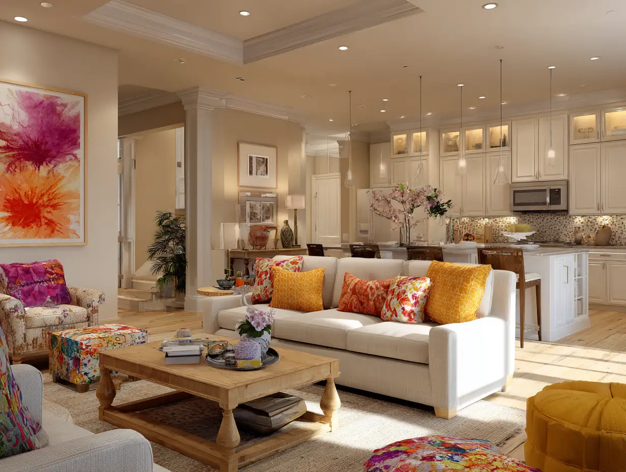
How to Add Colors in Home Without Commitment
Professional stagers live by one simple rule: keep color removable. Anything that can walk out the door keeps colors in home flexible, low risk, and easy to change as your taste or your plans shift.
The smartest approach is to anchor first, then layer.
The strategy that works
- Keep walls and large furniture neutral
- Add color through pillows, throws, art, and decor
- Repeat a color once or twice, not everywhere
- Let lighting guide how bold you go
If you want to experiment, do it in spaces that are easy to undo, like a powder room or reading nook, instead of committing to a main living area.
What works best
- Seasonal throw pillows you can swap
- Art that reflects your mood, not a trend
- Plants, real or faux, for instant life
- Colorful books styled intentionally
You don’t need bold paint or permanent choices to create personality. This approach keeps your home expressive without locking you into decisions you might regret, which is why it works just as well for everyday living as it does for resale.
Small, affordable changes often beat big commitments, a theme I lean into in 9 Affordable Home Improvement Ideas You Can Do Yourself.
FAQ: Colors in Your Home Answered
What’s the best color to paint my whole house?
There isn’t one single best color to paint an entire house. The most successful approach uses neutral walls as a foundation, then layers colors in home through removable elements like art, textiles, and decor so the space can evolve without repainting every room.
Do colors really affect mood?
Yes, colors directly affect mood and behavior. Green lowers heart rate, blue signals calm and trust, and red increases energy and alertness. Studies referenced by the National Association of Realtors show that color influences up to 90 percent of homebuying decisions, and it impacts how you feel living in your home just as much.
Should I repaint before selling?
Only repaint if your current colors are bold, dark, or clearly dated. In most cases, neutral walls paired with intentional pops of color give buyers a clean slate without stripping the home of warmth or personality. Homes that feel balanced and lived in tend to resonate more than spaces that look freshly repainted but emotionally empty.
What if I hate beige but need a little personality?
You can keep walls neutral and still have personality. The key is shifting where the color lives. Pillows, art, plants, and lighting let you express your style without making permanent decisions, so your home can evolve as you do. This approach gives you freedom, not limits, and keeps your space feeling personal instead of locked into one moment in time.
Final Thoughts on Using the Best Colors for Your Home
Here’s the mindset shift that changes everything: your home is not a showroom, it’s a living space that should support how you feel when you walk through the door. Color isn’t about rules or trends or getting it “right,” it’s about creating an environment that feels calm, grounded, and intentional for you. When you stop treating color like a commitment and start treating it like a tool, the pressure lifts and the process becomes lighter.
You don’t need bold paint, expensive renovations, or a perfectly coordinated palette to make your home feel alive. Start small, stay flexible, and let lighting and mood guide your choices. Whether you’re planning to live in your space for decades or preparing it for the next chapter, the best colors for your home are the ones that make you feel good being there, because that feeling is what turns a house into something that actually feels like home.
This is what I call the Home Hero Jen Mindset Shift, and it changed everything for me.
If you’re curious how accent walls play out specifically in bedrooms, Timeless Contracting does a great job breaking down color choices and how different tones affect the feel of the space, especially when you want personality without overwhelming the room.