Picking calm paint colors for bedrooms sounds simple until you’re standing in the paint aisle holding 47 swatches and second-guessing everything.
I’ve been there. I painted my own bedroom, picked a teal accent wall I loved in the store, and brought home the wrong shade entirely. Too dark, too bold, completely wrong vibe. I had to start over.
As a Former Real Estate Broker, I’ve also stood in hundreds of bedrooms and watched paint color make or break a sale. So I’m going to save you the guesswork.
This guide covers everything, from the psychology behind color to the shades that actually help you sleep.
Table of Contents
Why Calm Paint Colors for Bedrooms Affect More Than Just Looks
Most people pick a bedroom color because they like it. That’s not wrong, but there’s actually more going on than personal taste.
Color triggers a psychological response. Here’s what that means practically:
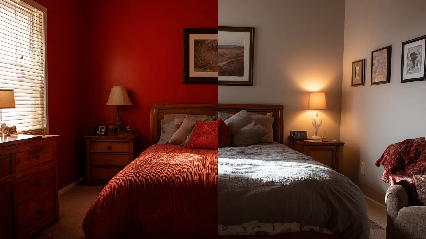
- Warm, saturated colors like red, orange, and bright yellow stimulate your nervous system, raise your heart rate, and signal your brain to stay alert. Great for a gym. Terrible for a bedroom.
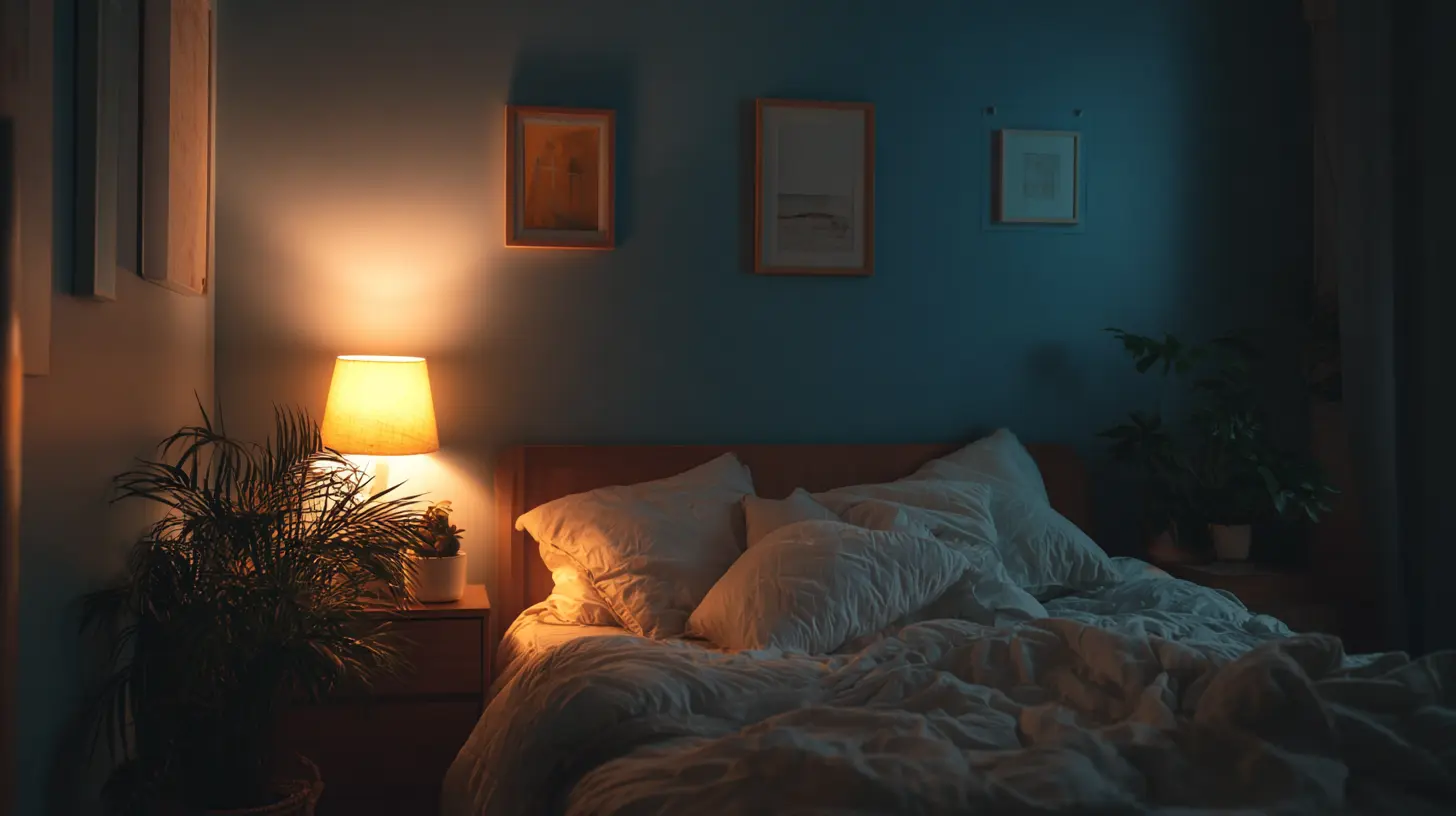
- Cool and muted tones do the opposite. Soft blues, sage greens, and warm neutrals tell your brain to slow down, lower cortisol, and reduce visual noise.
- The colors that make you sleep aren’t random, they’re the ones that stop competing for your attention the second you walk in the room.
Your bedroom should be the one place in your house that feels a retreat. Paint is the fastest way to get there.
If you want to go deeper on how specific colors affect every room in your home, I broke it all down in Colors in Home: What Each Color Does & Why It Matters.
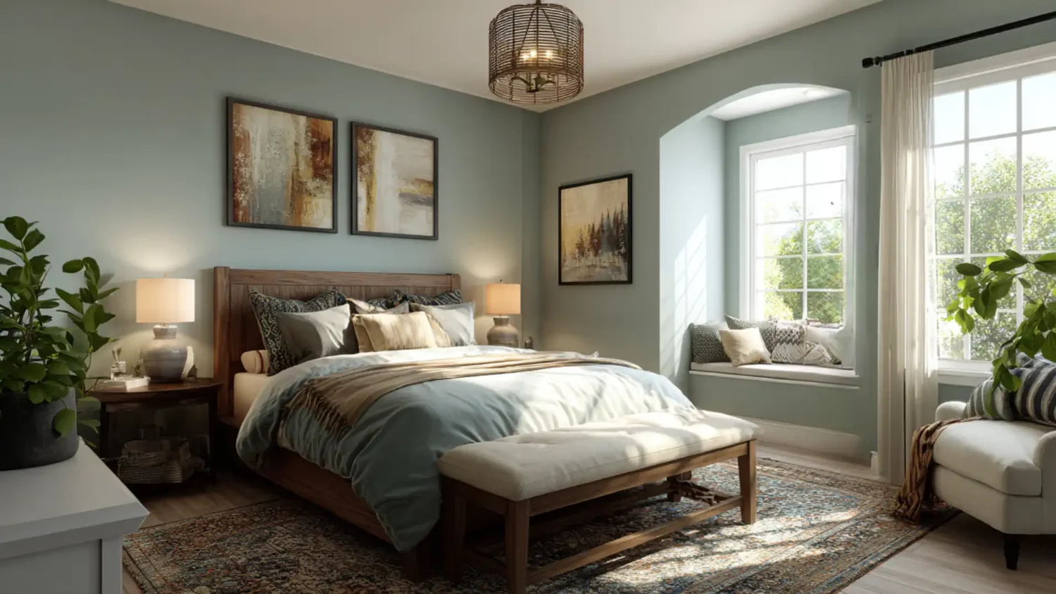
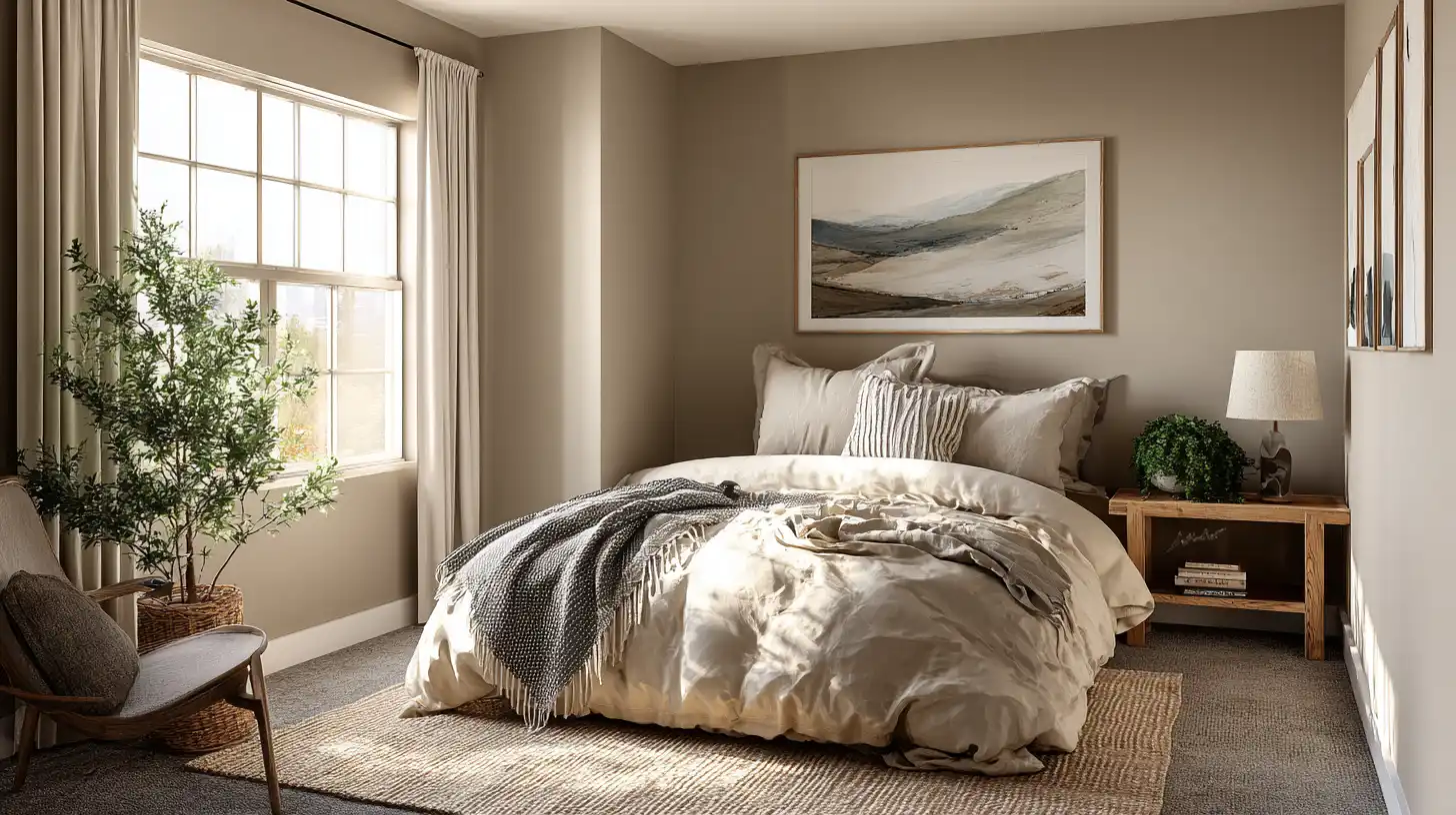
The Best Calm Paint Colors for Bedrooms
Not every neutral is created equal. Here are the best bedroom paint colors that consistently deliver that calm, cozy, sleep-ready feel:
- Soft Blue like Sherwin-Williams Sleepy Blue or Behr Reflecting Pool. Cool, quiet, and proven to lower heart rate.
- Warm Greige like Benjamin Moore Pale Oak or Sherwin-Williams Accessible Beige. Neutral without feeling cold or sterile.
- Sage Green like Behr Back to Nature or Sherwin-Williams Privilege Green. Earthy, grounding, and incredibly easy to decorate around.
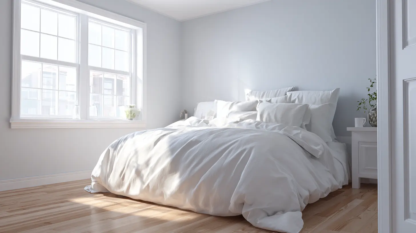
- Warm White like Benjamin Moore White Dove or Sherwin-Williams Alabaster. Bright without being harsh, pairs with everything.
And according to the National Association of Realtors, 2026 color trends are moving firmly toward warm, earthy neutrals. Sherwin-Williams named Universal Khaki their Color of the Year, and Dutch Boy named Melodious Ivory, specifically calling it a perfect backdrop for cozy bedrooms. The pros are pointing the same direction.
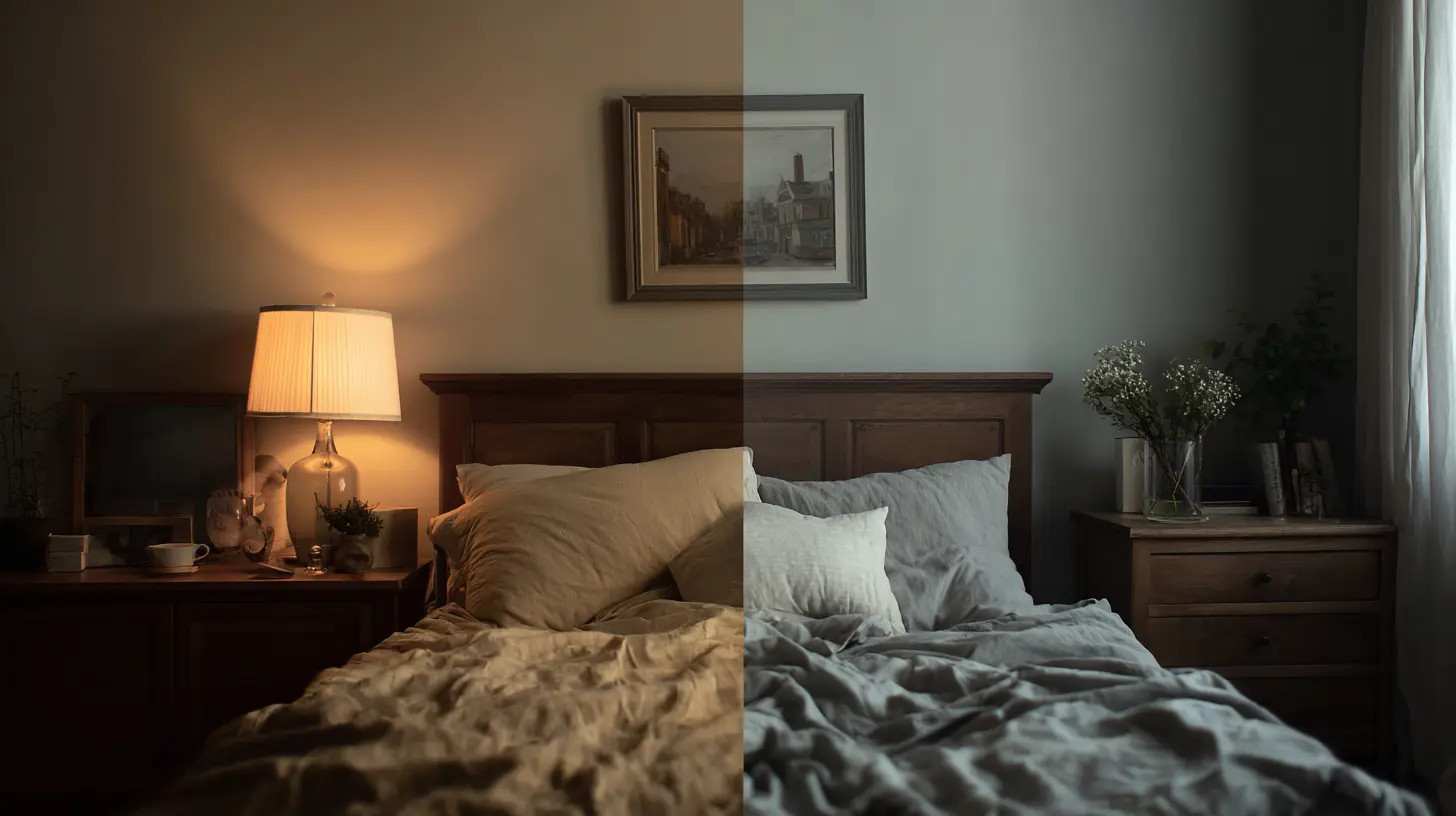
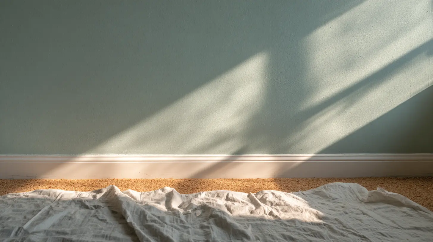
How Lighting Changes Your Paint Color
Here’s what you don’t know until you know. (And it’s too late) That perfect greige you loved on the swatch? It might look purple in your bedroom at night. Or yellow in the morning. Lighting changes everything.
Here’s how different light types affect your color:
| Light Type | Effect on Paint Color | What to Watch For |
|---|---|---|
| North-facing natural light | Cool, flat, bluish | Warm neutrals can look cold and grey |
| South-facing natural light | Warm, bright, consistent | Most colors look their best here |
| East-facing morning light | Warm golden tones | Colors shift cooler by afternoon |
| West-facing evening light | Warm orange glow | Can make neutrals look yellow or pink |
| Cool white LED | Stark, clinical | Makes blues feel icy, whites feel harsh |
| Warm white LED | Soft, cozy | Brings out the best in warm neutrals |
| Overhead fluorescent | Flat, unflattering | Dulls most colors significantly |
The best bedroom paint colors look completely different depending on which direction your windows face and what bulbs you’re using.
Feng Shui Bedroom Colors and Why They Work
Feng shui bedroom colors get dismissed as trendy or woo-woo, but here’s the thing. The core principles are actually just good design logic with ancient roots.
Feng shui is about energy flow. In a bedroom, the goal is to create an environment that supports rest, restoration, and calm. Color plays a huge role in that. Here’s how it breaks down:
- Earthy tones like warm taupes, terracottas, and sandy beiges are considered grounding in feng shui. They create stability and safety, exactly what you want in a sleep space.
- Soft greens represent growth and renewal without overstimulating. Sage and muted olive tones are feng shui favorites for bedrooms.
- Muted blues promote calm and trust. Feng shui bedroom colors in the blue family are especially recommended for people who struggle with anxiety or racing thoughts at night.
- Warm whites and creams keep energy open and light without introducing stress.
- Colors to avoid in feng shui? Bright red, neon anything, and high contrast black and white combinations. All of them signal alertness and activity, the opposite of rest.
You don’t have to believe in energy flow to benefit from feng shui color principles. You just have to want a bedroom that feels calm when you walk in. I mean life can be stressful enough, who wants a stressful bedroom? Not this girl.
For more on creating a bedroom that works on every level, check out Cozy Bedroom Decor: Proven Color, Lighting & Space Ideas.
Colors That Truly Make You Sleep Better
This isn’t just a an old wives tale. There’s actual science behind the colors that make you sleep, and it comes down to how your brain processes color before bed.
Here’s what research consistently points to:
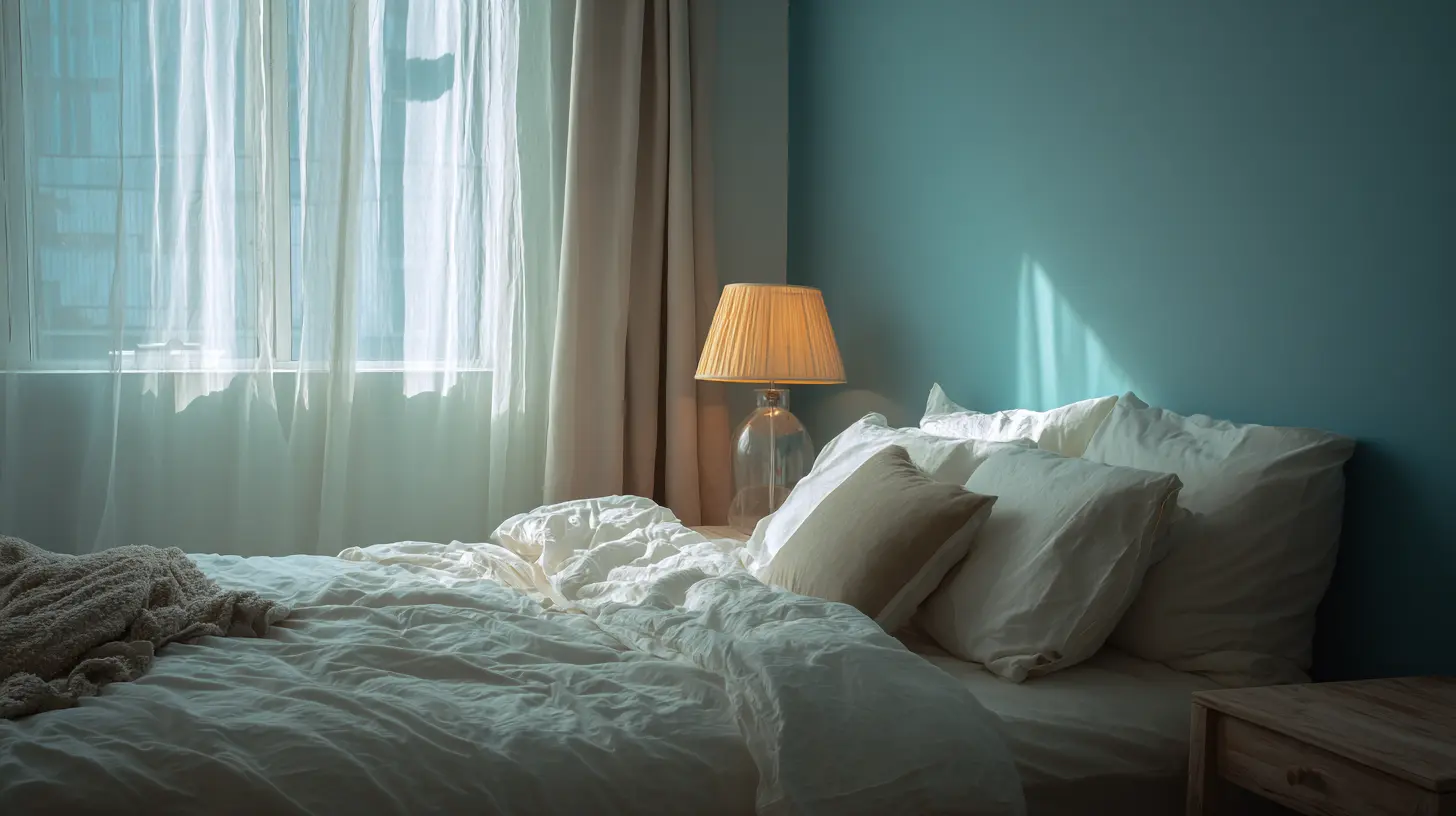
- Soft blue is the top performer for sleep. Blue tones are processed by the brain as calm and safe, lowering heart rate and blood pressure. Shades like dusty blue, powder blue, and slate are ideal.
- Lavender and soft purple promote relaxation and have been linked to reduced anxiety before sleep. Keep it muted though, bright purple is a different story entirely.
- Sage and muted green connect us to nature, which naturally lowers stress hormones. It’s why spending time outside feels restorative, your bedroom can do the same thing.
- Warm neutrals like greige and soft taupe create a cocoon feeling. They’re among the calm paint colors for bedrooms that work across every style and budget.
- Warm white keeps the room feeling open without introducing stimulating color energy.
Pair any of these with warm lighting and you’ve created a sleep environment that goes to work the second you walk in.
If you’re working with a smaller space, color choice matters even more. I cover that in detail in Tiny Bedroom Ideas To Maximize Your Small Space.
What NOT to Do With Bedroom Paint Colors
Just as important as knowing what works is knowing what to avoid. I’ve walked through hundreds of bedrooms as a broker, and the same mistakes show up over and over.
Here’s what kills the calm:
- Bold, saturated colors on every wall. A deep eggplant, a bright turquoise, a high energy coral. Each one might be beautiful on its own, but together they create a house that feels stressful to move through.
- Every bedroom a different bold color. When buyers, or you, walk room to room and the energy completely changes, it feels jarring instead of welcoming. Consistency matters.
- High contrast combinations. Bright white trim against a very dark wall sounds dramatic and cool in theory. In a bedroom it creates tension instead of rest.
- Trendy colors without testing them first. What looks incredible on Instagram at 2pm looks completely different on your north facing wall at 7pm. Always sample first.
- Skipping the accent wall prep. If you’re doing an accent wall, use [painter’s tape] and take your time with the edges. A sloppy line pulls your eye every single time you’re trying to relax.
If bold IS your personality and you want to make it work without wrecking the calm, I’ve got you covered in Maximalist Bedroom Ideas That Are Bold and Fresh.
How to Pick Your Color Without Overwhelm
The paint aisle is genuinely overwhelming. Hundreds of swatches, all looking slightly different, all somehow named things like “Quiet Moments” and “Restful White” as if that helps.
Here’s how to actually make a decision:
- Start with your feeling, not the color. Do you want cozy and warm? Clean and airy? Grounded and earthy? Nail the feeling first and it narrows your options immediately.
- Pull three samples maximum. Not fifteen. Three. Bring them home and tape them on your actual wall.
- Live with them for 48 hours. Morning light, afternoon light, lamps on at night. The color that still feels right after 48 hours is your color.
- Start with one wall if you’re nervous. An accent wall lets you test a color without committing to the whole room. That’s exactly how I started my own bedroom and I love it.
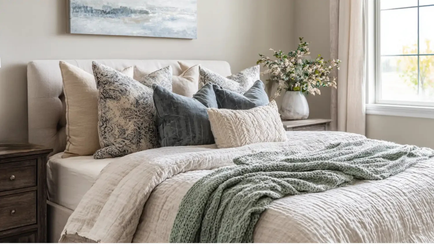
- Match your bedding after, not before. When choosing calm paint colors for bedrooms, pick your paint first and build around it. It’s much easier to find bedding that coordinates than to find paint that matches bedding you already own.
The best bedroom paint colors aren’t the ones that look perfect online. They’re the ones that feel right in your actual room, in your actual light, with your actual life in it.
If you’re thinking about resale value too, paint is one of the highest ROI updates you can make before listing. I cover exactly what buyers notice in Home Staging Tips: What Buyers Notice (And What Kills Sales).
FAQ: Calm Paint Colors for Bedrooms
What is the most calming bedroom paint color?
Soft blue consistently ranks as the most calming bedroom paint color across both design research and sleep studies. Dusty blue, powder blue, and slate all perform well. Warm greige and sage green are close runners up, especially if you prefer a warmer feel.
Do paint colors really affect sleep?
Yes, and it’s not just a design opinion. Cool and muted tones lower cortisol and signal your brain to slow down. The colors that make you sleep best are the ones that stop competing for your attention the moment you walk in the room.
What colors should you avoid in a bedroom?
Bright red, saturated orange, neon yellow, and high energy coral are the biggest offenders. They stimulate your nervous system and work directly against rest.
Is feng shui bedroom color real or just a trend?
The principles behind feng shui bedroom colors are grounded in solid design logic. Whether you believe in energy flow or not, the colors feng shui recommends for bedrooms, earthy neutrals, soft greens, muted blues, are the same ones that research supports for rest and calm.
How do I pick a paint color for a small bedroom?
Stick to light, warm neutrals or soft cool tones. Calm paint colors for bedrooms work especially well in small spaces because they visually open the room without making it feel cold or stark.
The Final Brushstroke
Here’s what I want you to know before you close this tab and go stare at your bedroom walls.
Most people wait until they have the perfect plan, the perfect budget, and the perfect color picked before they do anything. And then they wait forever.
You don’t need all of that. You need one sample, one wall, and one afternoon.
Paint is the most forgiving home update you can make. If you hate it, you repaint. That’s it. There’s no contractor to call, no permit to pull, no big commitment. It’s just paint.
Your bedroom should feel like an exhale the second you walk in. You deserve that. And you’re closer to it than you think.
Start with one sample. See how it feels. That’s your first step.
You don’t need the perfect color. You need a color that lets you relax.